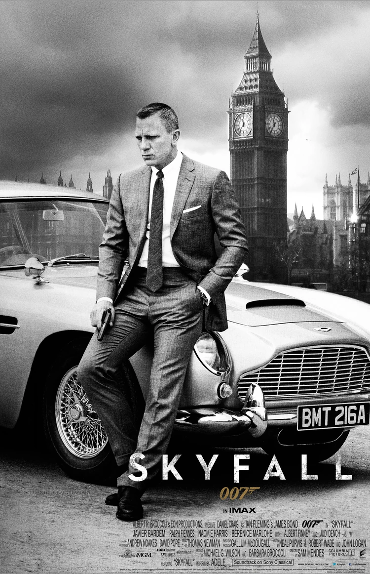
Originally I was going to have a much less serious looking poster to reflect the humour in my film. However I found it was hard to keep the poster looking professional in quality whilst doing that so I switched to a more serious and commonly used poster font; trajan. I also conveyed this sophistication through the colouring of my poster, it is not dark but relatively low in saturation much like the recent poster for Skyfall. I showed my genre through location as the MI5 building is clearly visible in the background however I left it as an enigma code how my character is related to the building. My character is young and female which should attract a wide audience of different ages and genders. Although having said this I tried hard to avoid catering solely to the male gaze and so my character is dressed practically in non revealing but fashionable clothing meaning that while she doesn't look bad, she isn't over sexualised. My tag line stands alone at the top, although it isn't a bold colour its positioning makes it stand out as it is in a relatively empty part of the poster. i felt this suited the tone of the poster better than if I went for a bright colour and it also grounds the film as having more of an understated British feel, again like the Skyfall poster.


According to George Gerbner's mean world theory a media text can leave its audience believing certain things about the people and places it portrays. These can be negative, such as believing all teenagers are criminals and therefore can negatively impact that societal group. While from my trailer it could be taken away that all men are evil due to the gender of the foes portrayed, it does however subvert the stereotype that all women are weak.