
These are very serious and somber titles which juxtaposes the comic violence of the film. They also serve to make it seem over the top serious which is an element that Tarantino often uses. However the slight glow to the Letters shows that it shouldn't be taken too seriously. The font is the sort of font you would expect from a western which is a genre that Tarantino often mimics in his films.

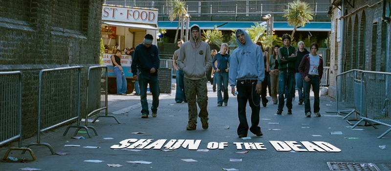
The opening titles of Shaun Of The Dead relies on the mundane for comic effect. It's a zombie film and the opening title contains zombies but none of the characters realize they're zombies because they could easily be confused with drunks or junkies on a Monday morning. This title works with the scene in a subtle way so that it blends in but is still slightly out of place. The font is big and bold like you would expect from a comedy but the letters are slightly eaten away to emphasis the zombie/horror element.

In the trailer for Taken the title burst up very suddenly at the end enforcing the idea that this is a very violent film. The monochrome also shows that it is a serious action/thriller and not a comedy. My film will have humour in it and so I won't go for monochrome to avoid giving the idea that it will be entirely serious to my audience.