Archive for 2015


Social Media Feedback:
In answer to the questions -
In what ways does my trailer remind you of other trailers?
What do you think are the strengths of my trailer?
What do you think are the weaknesses of my trailer?
"It reminded me of other trailers in that it introduced the main characters separately with screen cards with their names, and in that it had the like exposition shot of the boots at the beginning for interest, and that it wasn't one long scene but different scenes cut together"
"reminds me of other trailers with snippets of action, the bit at the beginning with the production company. strengths-variety of interesting locations used, made me want to know more about the plot. weaknesses-possibly a bit incoherent? maybe needs a voice over of some sort"
"it was kinda ambiguous at the beginning like you didn't know what kind of film it was going to be which I think a lot of trailers do... that was good and also the rain (I don't know if that was purposeful but hey) and the music was sick. I agree with Beccy that maybe a voice over would have been good"
"Strengths were that it didn't spoil the plot but hinted towards what might happen, and gave a clear indication of the genre so audiences know what they are going to see"
We also had a class discussion about each others pieces to give each group some feedback on what they had created."Weaknesses were that the transition between alex shooting will and becki and dead callum was a bit choppy, plus the musical transition wasn't very smooth"
I am glad that in using lots of shot clips I reminded people of other trailers. Also it seems the music itself was successful even if the transitions between tracks needed work. I have learnt that I need to spend a bit more time making all transitions smoother but also that title cards and dramatic settings are very effective at creating a trailer that draws people in. I also have learnt that I could improve the narrative of my trailer and make it clearer by introducing more dialogue and maybe a voice over. However people did seem to like the way I presented my characters, used props and introduced an enigma to encourage people to want to find out more. I have also learnt that using a variety of unusual shots was successful as it made my trailer stand out and also kept the audience's attention.
The three pieces I have created this year form an advertising campaign which should work together to promote the film. I have different aspects of my film captured in them. My poster is sophisticated to represent the genre and shows off the film's lead character so the prospective audience can get to know her. Meanwhile the Magazine cover is more fun and informal to pull in younger audiences while its position in a prestigious film magazine should draw in hardened film fans. These should both hopefully lead people to watch the trailer which would then provide more information about the characters, plot and tone of the film to help encourage them to then go and watch it at the cinema. I aimed to capture both the serious side and the fun side of the film in the trailer while it is more split between the poster and cover.

I used a variety of settings and locations so that I could appeal to a wider audience and also broaden the scope of the film. In screen grab 1 Rachel is in central London as is demonstrated by the sign she is standing next to, this is a conventional setting for and action/spy film and that is part of the reason why I chose it. Other reasons are that it is a more exciting location for the audience to see and it lends an air of sophistication to the production. However in screen grabs 3 and 6 we see more suburban/rural locations which subverts the genre conventions. In showing off a variety of locations I am doing something conventional of a trailer which will often do this to make the film look big and exciting.
I have dressed all my teenage characters in quite normal clothing for their age group which enhances the mundane realism however each one has its slight differences. In screen grab 4 we see Alex wearing a practical outfit of a vest top and shorts (just out of shot are work boots) this makes her look more practical than Beccy in screen grabs 2 and 3 who is wearing a dress to show her femininity. Alex is also holding a gun which is a conventional prop to use in an action/spy film. Also by having these guns and therefore action scenes I have created a typical action film trailer since they often contain more action than plot in order to give their audience an idea of what to expect.
I use a large variety of shots in my trailer in order to keep it exciting which is often done in action film trailers. Screen grab 3 is an example of a slightly more artsy shot I used in that it is a low angle, long shot with the characters silhouetted. I did this to make the fight look both more dramatic and realistic while also mixing things up since the previous shots had all been standard mid-shots. In screen grab 2 I have used a close up of Callum and Beccy to show the intimacy of the action and also to make the audience curious as to what they are talking about.
I set Rachel up as the main character by having her claim the opening shots of the trailer and immediately acquaint the audience with her. I then throughout the trailer have a series of "intro" sequences to introduce the other main characters, for example Alex in screen grab 4 and Taryn in screen grab 7. This introduces the idea of a team to the audience without giving away much of the plot besides the fact they are all female which should draw in a wider audience through female representation. This method of having "intro" sequences is used often in action film trailers such as Ocean's Eleven.
In screen grab 7 we taryn's face is bruised and grazed. I haven't used many special effects in my trailer since I didn't have access to good enough technology which isn't something most professional trailers have to deal with. Therefore this example of effects makeup is more subtle than is typical of most action trailers.
In what ways does your media product use, develop or challenge forms and conventions of real media products? (i.e. of teaser trailers/poster/magazines)
You should go through the final version of the project and select nine distinct frames which you screengrab and drop into a photoshop. You will be using these to write about how typical or not of teaser trailers your particular design is, so choose them carefully.
Once you have the nine frames neatly in Photoshop, screengrab the whole thing and post to your blog, then write an analysis of how you have used such conventions.
The aspects you should consider across your nine frames are:
The title of the film
Setting/location
Costumes and props
Camerawork and editing
Title font and style
Story and how the trailer sets it up
Genre and how the trailer suggests it
How characters are introduced
Special effects
Each one of these aspects should be a detailed post – try to be analytical and use media terminology in your response.
EVALUATION ACTIVITY 2
How effective is the combination of your main product and ancillary texts?

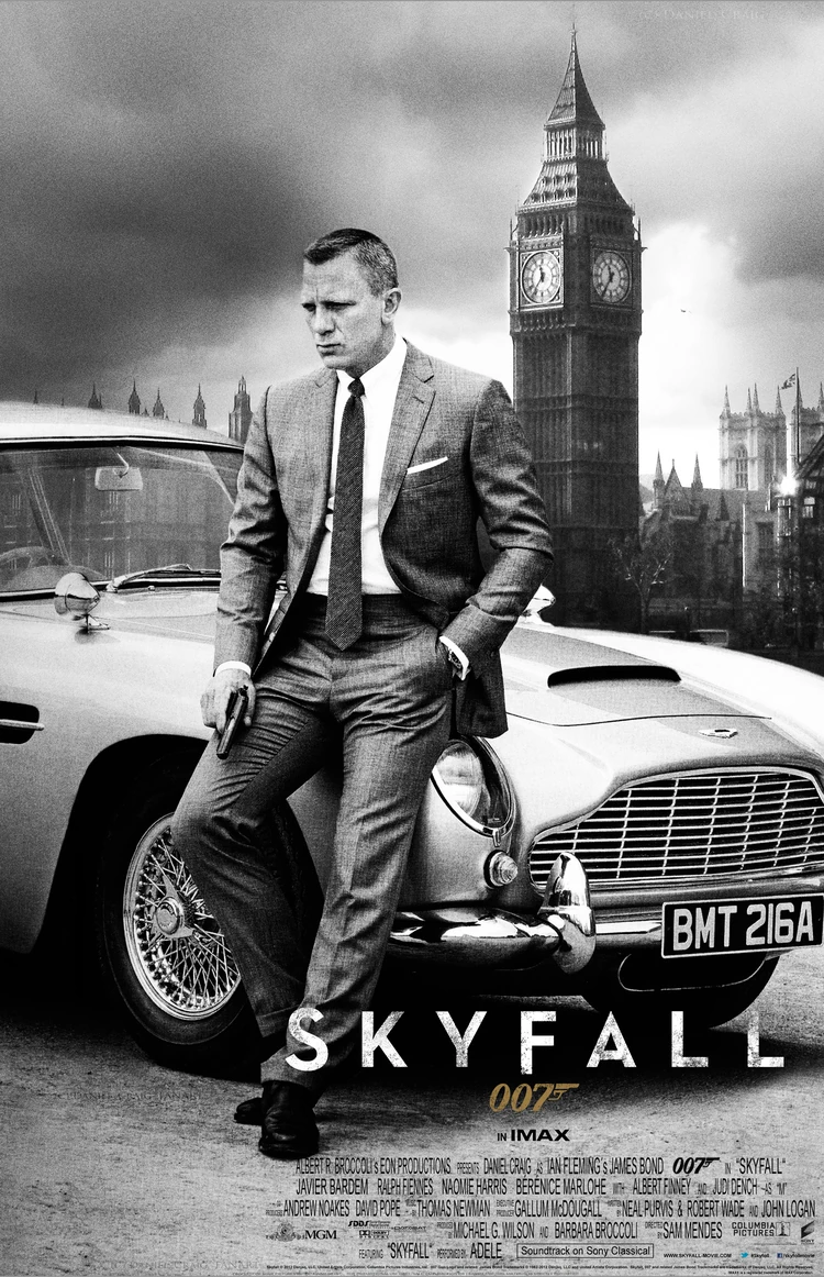
Originally I was going to have a much less serious looking poster to reflect the humour in my film. However I found it was hard to keep the poster looking professional in quality whilst doing that so I switched to a more serious and commonly used poster font; trajan. I also conveyed this sophistication through the colouring of my poster, it is not dark but relatively low in saturation much like the recent poster for Skyfall. I showed my genre through location as the MI5 building is clearly visible in the background however I left it as an enigma code how my character is related to the building. My character is young and female which should attract a wide audience of different ages and genders. Although having said this I tried hard to avoid catering solely to the male gaze and so my character is dressed practically in non revealing but fashionable clothing meaning that while she doesn't look bad, she isn't over sexualised. My tag line stands alone at the top, although it isn't a bold colour its positioning makes it stand out as it is in a relatively empty part of the poster. i felt this suited the tone of the poster better than if I went for a bright colour and it also grounds the film as having more of an understated British feel, again like the Skyfall poster.

According to George Gerbner's mean world theory a media text can leave its audience believing certain things about the people and places it portrays. These can be negative, such as believing all teenagers are criminals and therefore can negatively impact that societal group. While from my trailer it could be taken away that all men are evil due to the gender of the foes portrayed, it does however subvert the stereotype that all women are weak.


When looking into soundtracks Beccy and I decided to look at how music is used in the trailer for Ocean's Eleven (2001).
In this trailer several different styles are meshed together with snappy cuts to enhance the footage on screen. We decided that we wouldn't want to make as many cuts as in this trailer but we would make a couple to reflect changes in tone. We also like some of the jazzier styles of music as we felt that it reflected the more traditional allure of the classic spy film, eg. early Bond films. However as at the end of the trailer it hits a more somber tone it wouldn't be effective to carry this style on throughout the whole trailer. Instead at the end we are going to switch to a more classical piece to create a reflective atmosphere would both match the footage and encourage the audience to consider the film, while keeping the jazz to the scene at the beginning which is very much the sort of generic scene an audience would expect from a spy film. For some of the more climactic bits of the trailer there will some action shots hinting at the plot line, for this I wanted the music to be more aggressive and felt that string instruments would work well. To help Beccy understand what I meant by this I played her some of the music from both the Robert Downey Jr film adaption of Sherlock Holmes and the BBC TV show. In both of these strings are played aggressively to show the violence and emotional turmoil of a scene.
http://fontsinuse.com/in/2/formats/15/film-video
I looked at this article which shows which fonts these different films and TV shows use in their titles. One which is a similar genre to mine is the TV show True Detective which use quite classic looking fonts with minor detailing. This seems to be the case with most of the action genre, use of quite square, block fonts.
For my first font idea I have downloaded the font Ingrata as it seemed to have the right combo of bold, block lettering and personality. I have it on a red background for danger and violence.


.png)
.png)
.png)
.png)
.png)
.png)