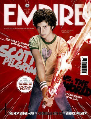
The overriding colour scheme of this poster is red+neutrals, however because Scott is wearing green this makes him stand out as it is a complementary colour. This has the effect of making him memorable to anyone reading the magazine so they are more likely to go and see the film. While other empire covers are usually more focused on the actual image this one conveys a lot more about the film through the almost empty space. Around the edge of the cover are lines like you would draw to convey speed or movement it is this kind of graphic element that hints to a similar theme in the film. The text on the cover also features pop-culture references which represents another key aspect of the film, by showing off these elements it gives potential audiences an idea of what the film will be like and encourages them to watch it.
The USP of this film is its director, Edgar Wright, he is well known for his quirky, stylized and humourous films, most notably his work with Simon Pegg and Nick Frost on their Cornetto Trilogy. As a result the cover makes this link clear by both displaying his name and making a link to the Cornetto Trilogy, This will build enthusiasm and trust around this upcoming film as well as bringing in any fans of his previous work.