Archive for January 2015

Titles analysis

These are very serious and somber titles which juxtaposes the comic violence of the film. They also serve to make it seem over the top serious which is an element that Tarantino often uses. However the slight glow to the Letters shows that it shouldn't be taken too seriously. The font is the sort of font you would expect from a western which is a genre that Tarantino often mimics in his films.

The opening titles of Shaun Of The Dead relies on the mundane for comic effect. It's a zombie film and the opening title contains zombies but none of the characters realize they're zombies because they could easily be confused with drunks or junkies on a Monday morning. This title works with the scene in a subtle way so that it blends in but is still slightly out of place. The font is big and bold like you would expect from a comedy but the letters are slightly eaten away to emphasis the zombie/horror element.
In the trailer for Taken the title burst up very suddenly at the end enforcing the idea that this is a very violent film. The monochrome also shows that it is a serious action/thriller and not a comedy. My film will have humour in it and so I won't go for monochrome to avoid giving the idea that it will be entirely serious to my audience.


Storyboard Animatic


The animatic has helped to show me how the trailer will be structured and what sort of length to expect it to be. I also made the decision to cut one shot from my original storyboard as when seeing it put together like this I felt it came across as too cliche and took away from the other shots. I have also decided on seeing how long each shot is visually that in some of the dialogue shots I may have overestimated how long the talking will take and so when it comes to editing those shots may be shorter and instead the time will be filled with more action shots in the second half of the trailer.

Soundtrack Analysis

When looking into soundtracks Beccy and I decided to look at how music is used in the trailer for Ocean's Eleven (2001).
In this trailer several different styles are meshed together with snappy cuts to enhance the footage on screen. We decided that we wouldn't want to make as many cuts as in this trailer but we would make a couple to reflect changes in tone. We also like some of the jazzier styles of music as we felt that it reflected the more traditional allure of the classic spy film, eg. early Bond films. However as at the end of the trailer it hits a more somber tone it wouldn't be effective to carry this style on throughout the whole trailer. Instead at the end we are going to switch to a more classical piece to create a reflective atmosphere would both match the footage and encourage the audience to consider the film, while keeping the jazz to the scene at the beginning which is very much the sort of generic scene an audience would expect from a spy film. For some of the more climactic bits of the trailer there will some action shots hinting at the plot line, for this I wanted the music to be more aggressive and felt that string instruments would work well. To help Beccy understand what I meant by this I played her some of the music from both the Robert Downey Jr film adaption of Sherlock Holmes and the BBC TV show. In both of these strings are played aggressively to show the violence and emotional turmoil of a scene.

Font Research

http://fontsinuse.com/in/2/formats/15/film-video
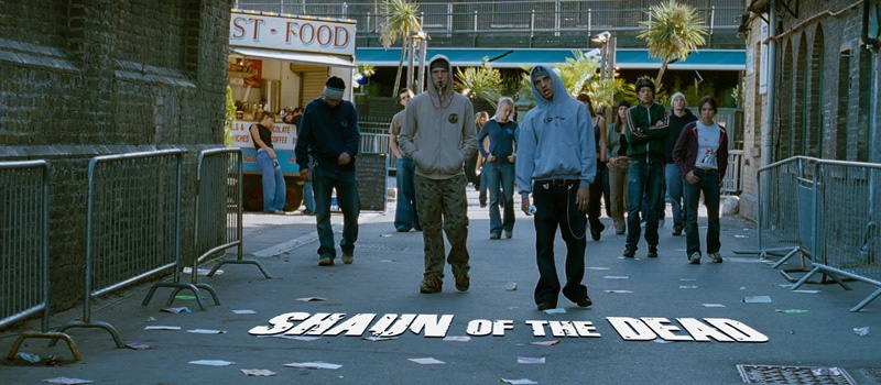
I looked at this article which shows which fonts these different films and TV shows use in their titles. One which is a similar genre to mine is the TV show True Detective which use quite classic looking fonts with minor detailing. This seems to be the case with most of the action genre, use of quite square, block fonts.
 For my first font idea I have downloaded the font Ingrata as it seemed to have the right combo of bold, block lettering and personality. I have it on a red background for danger and violence.

According to the article - http://justcreative.com/2008/09/23/top-7-fonts-used-by-professionals-in-graphic-design-2/ - Trajan is the most commonly used font in film which means that it would be stereotypical to use it as below. However it does also make the title look more professional.

Audience Profiling

The audience of your typical spy film are usually mostly male which I am trying to even out by creating a film that will also appeal to women. The age is generally speaking 15 and up with the most emphasis on the lower and higher bands of this range.